Wednesday, 20 November 2013

Magazine Advert Reflection


Magazine advert reflection

My group and I each had to make a magazine advert that would fit the conventions of the genre, which in our case is Indie. We each tried to portray what we want our artists image to be like, this included making a background. Our target audience being 15-25 we had to make sure we made it appealing to suit this group of people. I took my research from other artists album covers. This gave me lots of inspiration as they encorporated many different conventions into one. Some of the album covers that gave me ideas were Justin Bieber as long as you love me, Bakonoba, Wretch 32 and Jessie Ware. These were all different as some of them were close up, shots from the side and also have pictures with guitars which we would encorporate in our music video. This has given me a bigger insight into what a good music album cover should be.
For my album cover i would like to make sure the guitar is a main prop as it is a conventional for alternative artists. I would also like a cover on the digipak to be a picture of Georgia from the side. I think this would be a nice image to use as its quiet a striking image.
This has given me a good start with the range of images i would like to add and how to photoshop them, it will also help me come up with other ideas to be in the digipak as they all have to be related. I would also like a guitar to be on the cd of the digipak this would look nice and also relates to the whole digipak and the artist representation, as we have a performance piece in the music video where she is playing her guitar.


I think my magazine advert is fairly conventional for my genre which is Indie, I have used a light blue for the title of the advert which complements the colour of Georgia's jacket. This also stands out to the audience which allows them to see the title clearly. I have used a background which has graffiti and posters stuck on to it, this follows the conventions for the Indie genre as it's quiet edgy. Georgia is pictured waist up, so we can see what outfit she is wearing. She's chosen some strong colours to wear which would allow the audience to perceive that she is a strong person. This makes her very relatable for some audience members. The typography that I have used stands out before the background. This allows it to be clear while members of the public are viewing the advert therefore making them away of who she is. The font is very strong which again follows the conventions for Indie artists and with the colours used for Georgia's clothing. This shows the audience she is a fashionable artist, therefore fits in with Dyers star theory. Although Georgia is not looking towards the camera we can still see her full face, this allows the audience to remember what she looks like if she ever does come up again throughout her career. Georgia also has a smile on her face which lets the audience know that she loves to make music, she seems like a very happy girl, who is enjoying her career. With this the target audience are more likely to appreciate her music and want to listen to it.

While preparing to make the advert, I practiced some designs on paper, these were very conventional ones, although the idea that stood out especially for me was a mid shot of Georgia like the one I've chosen as my final advert. If I was to do my magazine advert again, I would increase the amount of typography which would provide more information for the audience. I think the colour stands out but the font used needs to be made a bit more playful, therefore can attract the audience. 


Georgia's advert-


I think Georgia's advert has tied in very well with the codes and conventions of the Indie genre. She has involved the brick wall, with a different twist which allows a review to appear through the top. She also allows the artist to appear in full lenght where the audience can see more of her style and the clothes she wears, therefore can imagine what her songs would be like. The typography she has used is bold, we see lots of information which let's the audience know what she is debuting and when her album will be out. She has also recorded on the magazine advert the song which is in our music video, this is then believed by the audience to be her first single. Although the artist isn't seen smiling, if allows the audience to think that the album is a deep and emotional album, which is used in the Indie genre. 


Jenna's advert-


For our final magazine advert, we have chosen Drew's. My group and I believe his final product has the most Indie conventions throughout, it also relates to the digipak, which he created. We feel that his work will be able to get us the most marks and he has added information about the album to attract the audience and also conventions which suit the indie genre such as the brick wall which Georgia came up with. The background which Drew has used shows a naturalistic background, this ties into the conventions of the Indie genre, as there music videos and ancillary products are very natural and real. This also connotes the artist to be natural and real aswell, which would appeal to the audience when buying her music. The typography used for 'Georgia Ray' stands out. This allows the audience to see the artist and carry on reading the magazine advert. Both the digipak and the magazine advert use pieces of newspaper, this idea is very original and stands out although personally I don't think it follows the conventions through the magazine advert and of the genre. 


Tuesday, 19 November 2013

Photoshoot

Why is it important to carry out a photoshoot, especially when creating a digipak and magazine advert?

It is important to carry out a photoshoot while creating a digipak and magazine advert as it helps to promote the artist. In our case for an Indie artist we would have to represent that genre in the clothes Georgia is wearing. For my digipak I used images of Georgia's guitar, a picture of Georgia facing away from the camera and one of Georgia facing the camera sitting on a tree. These show a soft side of our artist Georgia Ray, it is conventional to the indie genre as there are many sightings of guitars and the clothing that Georgia is wearing connotes a young indie girl going through young love. It appeals to the target audience which is from 15-30 year old girls, as we can see pictures of a young pretty girl who appears to be having fun in the music video and in the pictures in the magazine advert and the digipak.


What images did you take and why? (include a variety of shots that can be used)

Throughout our photoshop process we took many pictures both of Georgia individually and both Drew and Georgia together. We had many different settings in which we filmed that would look good for the photo shoot aswell, such as the forest in Loughton where we filmed the performance part of the music video, these pictures related to the song that we chose 'The Apple Tree' as we have taken pictures by a lonely tree in the middle of the forest, this is part of goodwins theory which is based on 8 factors one of which is links between lyrics and visuals. There are also pictures taken for the photo shoot in Camden. This was an ideal place for a photoshoot for an indie music video as it is a cool surrounding with edgy features and graffiti everywhere which gives an edgy effect in the pictures. We decided to use both of these settings as areas we would have a photoshoot as they contrast each other, one showing the innocent side of Georgia and the other showing the rebellious side of her. We get to see Georgia making lots of different faces showing a range of emotions which relates to how her audience would feel. This lets the audience feel like they have more of a similarity to Georgia Ray and support her success. 


Where will your images be used and why ? (digipak or advert)

Our images which have been taken during our photoshoot will be used for the magazine advert and digipak. For my magazine advert I chose a picture of Georgia from the first but cut the back out and put it on a graffitied building which relates to the genre of the music video and ancillary products. I used many different pictures for the digipak which were all from the photoshoot in the forest. These worked well and were all related to each other which showed that they suited each other well. A convention of Indie is also guitars, which I used in the my digipak for the cd cover which features a guitar, this works very well and fits the conventions for the genre and the rest of the digipak. I think the pictures I used for both ancillary products worked well, as we see a raw version of Georgia Ray which will be appealing for the target audience and will encourage other audience members to view her work. For my digipak I have chosen pictures of Georgia looking vulnerable and happy which will again be relatable with her audience this encourages Dyers star theory which believes an artist can build a relationship with an artist.


How are your images conventional to your genre?

Our images are very conventional for our genre, we have used our settings to fit in with the conventional music video. The genre of Indie has tied in well, as we use a guitar with Georgia for lots of the shots. This is a convention to Indie. Georgia clothing again is extremely conventional which relates to Nina Nesbitt and other Indie artists. The outfit Georgia has one will appeal to the target audience and they will relate more to the artist as they are clothes that they may wear. We made Georgia have quiet an easy going look as though the clothes are off the high street so the audience would possibly spot something that they may have seen or even have for themselves. The colour which we have used that represents Georgia in the ancillary products and the music video is dark red, this ties in with the leaves that surround her in various pictures as an autumn colour. It is also conventional for the Indie genre. By showing off her guitar in many pictures it shows the audience that she is a very natural and real musician. This lets the audience know that she is down to earth and loves to make music. Many of the pictures we have taken of Georgia for the photoshoot are where she is playing the guitar this shows the realness of her that she is happy playing her guitar and not caring about anything else. This lets the audience find out more about her rather than the image that she is trying to perceive.


How do the images portray the artist and how does it appeal to your target audience ?

The pictures taken throughout the photo shoot appeal to the audience as they show that shes making music because she loves to make music. They show a real side of her that many artists don't have these days. This lets the audience find out more about her and the music that she makes rather than a character she is playing throughout her music videos. They show off a naive side of Georgia that many fans will find interesting which contrast against the music video where we see Georgia rebelling against society. With various images which show a strong side of Georgia and a weak side, means that her audience will be able to see many sides of her and what makes her a strong girl. We see a side which makes the audience want to listen to her music and a side which makes the audience want to find out whats made her so strong. Each picture that she has taken that's gone into the photo shoot lets the audience know more about her personality and make them willing to find more out.


Include one example of how you photoshop to create a conventional product (include before and after images)

Analysis of Digipak

Digipak analysis

Objective: to analyse the conventions of a music digipak

Outcomes:
All:
 will be able to anlayse 3 conventions with examples
Most: will be able to anlayse the digipak and make excellent reference to the music conventions and target audience with examples
Some: will be able to use the analysis as inspirations and create a conventional music digipak

Starter:
1)     What is the purpose of a digipak? 
2)     How is a digipak different to a CD album?

Task 1: Analyse the following digipak. Ensure that your analysis is detailed and that you have included excellent examples to support the points that you have made. Also relate back to the music conventions and the target audience.

·     Representation of music artist
·     Connotations of the digipak
·     Colours
·     Design/layout
·     Choice of images
·     Typography
·     Style of language

·     How does the digipak promote the music genre?
·     How does the digipak attract an audience?

image


Task 2: Analyse 1 digipaks, one for your chosen artist, using the same bullet points above.
Include a summary at the end of your blog to show how you will use your research to inform your planning and creating your own digipak for your own artist.  


The purpose of a Digipak is to promote the album and the artist. It tells the audience the songs which they are publishing in the album. In order for lots of people to know that their is an album on sale, the digipak needs to be eye catching. It also needs lots of advertising so that people will know that their album is coming out so that they can buy it. It will not only attract the primary audience but the secondary audience aswell. In addition to the digipak their sometimes is promotional materials that could be booklets of posters. This will help promote other projects that the artist may have outstanding. 

The difference between a CD album and a digipak is that their are pictures inside the CD case, this has more images that shows the audience what the artist relates to and lets you have a closer look into the eyes of the artist, it also is a patented version of a CD album. 


Task 1: Analyse the following digipak. Ensure that your analysis is detailed and that you have included excellent examples to support the points that you have made. Also relate back to the music conventions and the target audience.

·     Representation of music artist
·     Connotations of the digipak
·     Colours
·     Design/layout
·     Choice of images
·     Typography
·     Style of language

·     How does the digipak promote the music genre?

·     How does the digipak attract an audience?


Tuesday, 5 November 2013

Magazine Advert Analysis

Magazine advert analysis


Task 2: Analyse 2 magazine adverts, one for your chosen artist and one for a similar artist, using the same bullet points above.
Include a summary at the end of your blog to show how you will use your research to inform your planning and creating your own advert for your own artist.  


The purpose of a magazine advert is to promote the artist. This is whether its to promote an album, a tour or a song. In my case, Nina Nesbitt is promoting a UK tour.


Nina Nesbitt's representation is that she is an indie musician, who writes her own music and is very raw. This makes her original to other artists as she is very down to earth and still makes music with her guitar. Nina is iconic for singing while playing the guitar, as in most of her videos there is a guitar as well as in the track. In the poster shown above, you can tell she has a different style, by wearing a chequered top with sunglasses while performing. This shows how laid back she is while performing and that it comes naturally and she doesn't have to pretend to be something she's not for the record label. You can also see her guitar strap which connotes her rawness that she plays guitar while on stage singing, and that if anything did go wrong it wouldn't matter because she could pick it back up and no one would realise. She also is smiling, this shows that she is happy with what she is doing and enjoying being up on the stage showing people her music. 

The colours on the advert are quiet dark with white writing to stand out. The picture seems to be taken from a festival that she was performing at as she is wearing sunglasses. She has her own signature logo which she uses on albums and singles. With 11 tour dates in the UK this shows that she is popular although she's only been in the industry for a short time. This handwriting is in simple white writing so it is easy to understand. 

The layout used attracts you to the advert as there is a pretty girl who is smiling. This makes you intrigued to find out what it is all about. The bold writing with her name on the front again makes you want to know more about her and hear her songs. I think the choice of image is good as she looks as though she's having a good time and you always want to be involved. Because it is a candid shot this makes her more natural and more approachable, letting the audience enjoy her music more. 

There isn't much language used as they are listing the dates where and when Nina Nesbitt will be performing. The advert promotes the music genre as you can see she is using a guitar so has an indie style to her music. This will attract those who like other alternative artists. The advert promotes the artist as they see that she is performing in many different cities in the UK. This means they may be able to buy tickets and see her performing live or even search her on youtube to find out some of the songs she has written.

The advert attracts the audience as it is very bold with one picture that stands out, this makes them want to know what it is about as they don't see Nina's face all the time. This makes people become aware of her as a singer and can become interested in her. Also because she is young and her audience is of a young adult age, they will feel like their going through the same life experiences at the same time as Nina which will make the audience connect more with the artist and the music. 


In this second Nina Nesbitt advert for a song named ''Don't Stop''. This seems to be a more of a planned photo shoot for the single. We can see her name Nina Nesbitt in writing which was used in the advert above for her UK tour. This has been established as her personal logo. Once again the picture of Nina in the forefront is what you are drew to when you look at the advert. Her make up stands out and she looks like she's portraying a strong image unlike 'The Apple tree'. With bold lips and eyeliner she looks as though she's in control rather than being controlled. There is a lot that is going on in the advert as the background has an arty pattern which is half covered by Nina. Although their isn't anything to say she is a singer with her releasing another song we can presume that she sings and that she has had success with songs before. 

The colours on this advert are brighter than the advert previously and this advert is aimed at the audience more with Nina looking straight at them. The writing stands out with a bold green box around the song title. This will make the audience members look at the box first and see what the song is called, like the first advert the Nina Nesbitt logo stands out and is visibly seen as you read the advert. 

The layout is set out well as you can see Nina Nesbitt's face which obvisiously is the main object on the advert as they are showing you the artists image. We cant see what clothing she is wearing which means we can't tell she's an Indie artist, although from her hair and make up i think most of the audience would be able to tell she's an Indie/Pop singer. 

I think the image that has been used for the advert is well chosen, she isn't expressing any emotion which lets you ave your own insight into what you think 'Don't Stop' means, this keeps you guessing until you buy the song and listen to it. Unlike the previous advert she isn't wearing sunglasses this shows that she's more interested in connecting to the audience this time, and wants the audience to know the real her rather than the image that her record label portrays her to be. 

While researching adverts from Nina Nesbitt the artist who's song my group and I are using. I have found ways in which it would attract the audience. I've found that with the artist making eye contact with the audience it makes it more personal for both the artist and the audience. This I what I hope to make in my advert. As we are promoting a magazine advert you would expect a lot of her body to be in it, therefore the audience can see her clothing and decide what genre they think she will be. Making the writing simple on the magazine advert would also attract the audience. As if you have lots of writing in small font, the audience probably wouldn't want to read it to find out more about it. Another attractive part of the magazine advert is the background. If you have a boring background the image does stand out more but it  wouldn't necessarily look very appealing and would look fairly simple to the audience. 


Friday, 25 October 2013

Planning lighting and colour *

- why are lighting and colours important within a music video
- what styles of lighting will you include and why? what effect does it create?
- what colours will you include and why? effect?
- how is it conventional
- how does it help to build a relationship with your target audience?


Lighting and colours are important within a music video as they give the music video a certain atmosphere that relates to a target audience. It also lets the audience know what genre it is and will relate to the mood of the song. The lighting in our music video varied, throughout different shots and settings we changed it from low key to high key such as when both the actors are in bed, we see a low key lighting from the fairy lights from the room, whereas in contrast when there is filming in the forest we see that there is high key lighting so we can see the artists facial expression and he playing the guitar. This gives the music video an upbeat feel and makes the audience seem as though she's comfortable in her situation. A lot of the music video was filmed outside which meant we couldn't change the lighting that we had, this was good as when it was starting to get dark or was a bit dark it fitted our conventions for an indie music video.


We will be using high key lighting for the performance section of the music video and for the memories there will be a few dark scenes which shows the edginess and rebellious behaviour of the actors in our music video. We have included one of our main colours as red, this shows our audience with the pieces of clothing such as the bandana that we are following indie conventions. Most of our audience will probably be indie fans and will relate to the music video, by the way Georgia and Drew dresses, by the area that they are in for some of the music video which is Camden and Brick Lane which both are known to those who consider themselves Indie. Therefore they know where it is set so feel more connected to the music video, and when Georgia performs her performance piece the audience would feel as though Georgia was singing just to them so they feel special. As the audience will probably be from 15-24 they may be going through the same situation that the song is based on so may be able to connect with her via the song. 


We have managed to tie in lots of colours and different amounts of lighting throughout the music video. This connotes the amount of emotions that Georgia feels throughout the song. This lets the audience relate to the artist and therefore have more of a connection with her. The colours in which Georgia wear throughout her performance part in the music video are all very bold colours. This  allows the audience to feel the strength she has as a person but also contrasts with some ways that she presents herself as being nieve and hurt from the situation that occurred between her and her boyfriend. As we can see Georgia wears a lot of black, this connotes her rebellious behavior which we have seen in the music video. The red lipstick which she wears shows the older side of her, that she can take care of herself and is a strong women, it also coincides with the scarfs colour. This could also relate to her being angry and frustrated. 

When we see Georgia and Drew walking around Camden, Georgia wear different clothes, this shows the diversity between her character when she's with her boyfriend an without him. Also wearing dark colours we again see the side which we saw in the performance section which  made her feel empowered. These clothes which she is wearing through the narrative are more conventional to the indie genre. This allows the audience to relate to her more as she walks around place which are known to have there own unique style and unique people who shop there. The lighting while they are in Camden when they cross the street is very high key. This shows that the memory is a nice memory and that they are having fun. We see that the rebellious side of Drew comes out later on as it gets a bit darker. This could influence Geoegia Ray to become rebellious.

In order to connote the impression that Georgia Ray and Drew are making memories we needed to add different lighting. This would let the audience feel as though these pieces of footage are going over a few days. It also lets the audience see the contrast between the different memory's they have. At the beginning there are more high key lighting while at the end we see more low key lighting. This shows that throughout the music video their relationship goes from being good to being bad. This Is shown by having a bonfire at the end. This makes it seem to the audience as though the relationship has caused a lot of anger in Georgia and she's letting it out burning his belongings. This also shows again how she is a strong woman, as she has done this by herself. The red clothing that we see throughout the music video relates to the end of the music video using the same colours as red connotes anger and fear. The feelings that Georgia Ray feels. As it is a narrative music video it lets the audience experience escapism. This allows them to enjoy the music video more while forgetting about troubles they have in their own life. 

Wednesday, 23 October 2013

Planning Editing Styles

- why is editing important within a music video
-what editing styles are you planning on including and why? (4) effect?
- how are your editing styles conventional to your msuic genre
-how will your editing, help to build a relationship with your target audience?


Editing is important within a music video as it can distinguish the different between a fast paced music video and a slow paced music video. These both use different editing skills. A fast paced music video like ours will have many quick scenes which will attract the audience more as there are more shots which will tell more of a story. This also attracts the audience as most people prefer fast paced music, on the other hand slow paced music will use a single shot and use it for a few seconds while panning or zooming. In order to edit, we have used a programme called Final Cut Pro. This allows users to cut footage and crop it to fit in with the segment before. It also lets you move them around and at effects to make the music video look more professional. 

What editing styles are you planning on including and why? 

In our music video we have decided to make it look like there are memories, in order to let this come across to our audience we have chosen use effects such as sepia or monochrome. We also used sharp lighting in between clips to show that it's a contrast between a memory and the present time. For the audience to differentiate between the past and present, there is a change of lighting and edits within the footage. I think that the editing style is conventional for the Indie genre and with the different memories which it shows and the editing which is used it shows the strengths and weaknesses in the relationship. This makes the target audience for Georgia Ray wider as it will relate to anyone going through a tough relationship. It will also allow audience members to remember memories that they shared with loved ones. 
An editing style that we have used is Blurred frame. This allows us to have part of the frame partially blurry and another part of the frame clear. This lets the audience know what part of the music video they need to focus on. 

How are your editing styles conventional to your music genre?

In our music video, we have used many straight cuts and fast paced frames. This gives the impression that it's telling a story. We have used a very simple editing style so the audience dont get distracted by the cuts. On the other hand we have used lots of effects which help the audience differentiate between present time and memories. In the indie genre, we regularly see simple editing so they don't let themselves become to mainstream. We also see very simple story lines, which we have tried to recreate with our storyline. A boy and a girl who are in a relationship and go through a rough patch disclosing many memories they have had during the music video. 

How does it build a relationship with your target audience? 

The editing styles throughout our music video relate to the audience as with many straight cuts it allows the audience to focus more on the story line and music video itself rather than focus on the different editing styles which we use. During our music video we have many different paces, such as fast and slow. These change throughout regarding the lyrics in the song. This outlines dyers star theory who believe lyrics and visuals have a relationship. With the different styles it allows the artist to have a bigger target audience, those who like slow paced songs and those who like up beat songs. This will encourage the audience members to be interested more in the artist and listen to their other songs. The fact that the audience are more likely going to understand the music video with the simpler editing styles means that the audience will be able to see more of what  Georgia Ray as an artist and as a human being is like. This will let them relate their idol more and grow a connection. 

Tuesday, 22 October 2013

Planning Artist Image *

Clothing
Hair
Makeup
Purpose
Conventional


As Nina Nesbitt herself dresses Indie-like we have decided to keep it going with the same style. Georgia will wear a bandana and Dr martens which are conventional for the Indie style. Her hair will be tied up quiet messy which again is quiet conventional. Georgia's makeup will be quiet simple and little of it, as we don't want their to be too much makeup. The purpose for Georgia dressing the same is we know the genre is Indie and as the audience are watching we need the artist's image and the song to be the same so its more relatable. The whole costume will be quiet relaxed as the music video is set in a field and in London where she is with her boyfriend in the song.


clothing
hair and makeup
purpose of
what effect they create
how conventional
build relationship

The purpose of clothing, hair and makeup is to connote an artists personality, feelings and emotions to the audience. This gives clarity and understanding of the narrative and its underlining meaning. Clothing can highlight features of someones personality through for example colour, e.g. black can represent either the artist being rebellious or that their unhappy, whereas if an artist was to be dressed in red, suggests that their romantic and affectionate. Hair and makeup can also suggest emotions as well as their current behaviour and how they wish to carry themselves; for example if an artists hair was styled in a neat up-do with minimal makeup on, suggests sophistication, whereas caked on makeup with a scruffy bun may suggest that that they don't look after themselves. When planing clothing hair and makeup, my group and I need to consider whether all elements are conventional to our narrative and genre, and also suggests the correct meaning and emotions, in order to build a relationship with our chosen target audience.

In the opening scene our characters Georgia and Drew are going to be dressed in casual and indie-like clothing. Georgia will be wearing a minimal amount of makeup, with a little eyeliner to be conventional to the typical indie girl and they both will have common hairstyles but with a slight 
edge, for example Georgia's will be backcombed to give greater volume. Both elements will help to connote their comfort around each other. The audience instantly begin to build a relationship with the song, as many are able to relate to the 'comfort' stage of a relationship. The purpose of this style is to emphasis how close the couple are and they are happy enough to act and dress casually, not worrying about personal appearance when spending time together. The style of clothing is conventional in the way they follow the typical indie codes and conventions; clothing such as a denim jacket and checkered elements. The fact that the visuals will match the lyrics, means that our chosen audience will be able to relate to the couple, as they consist of typical elements in which happen in every relationship, such as the 'comfort stage'.

Another section of our music video, when the couple are seen in Brick Lane, the couple are dressed in darker coloured clothing such as black and emerald green. Within this part of the video, the 
lighting has become low key showing the development through the day; from morning to evening and how it livens up as the video progresses. Georgia is seen to be wearing an emerald green tartan dress with a leather jacket on top, tights and Dr.Martins. With Drew wearing a tartan green top, a baseball jacket, black jeans and Dr.Martins. The fact that both are wearing elements of tartan green clothing and Dr.Martins makes it obvious to the audience that they are a couple and have a similar style, connoting how similar they are in personality. Again the elements of tartan, a leather jacket, as well as a baseball jacket are all very indie-like. This is conventional and follows our narrative well in helping to connote a relationship. As the night falls, in order to portray more of a lively atmosphere, where the two characters become more rebellious, going against Dyer's star theory. The style of clothing is very relatable for an audience, especially one of a similar age to our characters, therefore they begin to build a relationship and even possible set a trend.

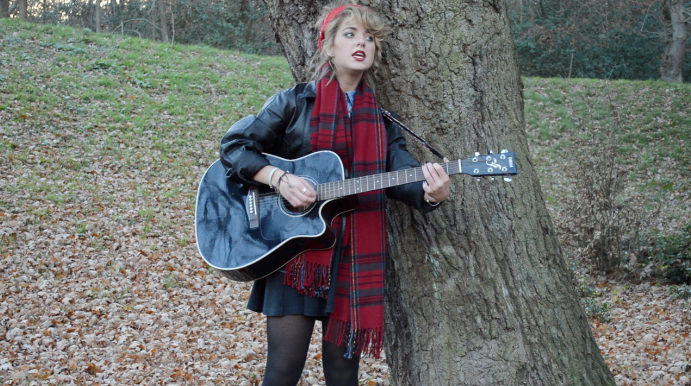
Within the performance, this time it is Georgia alone which makes her the main focus, portraying herself as the commodity. Georgia is dressed in a black skirt, leather jacket and tights, black Dr.Martins (a theme that follows through in the majority of filming shots), a denim shirt and tartan green scarf. All of the elements of black gives off an edgy vibe, however is toned down by the tartan scarf, denim jacket and red bandanna, therefore creating a balance between following and rebelling against typical indie conventions. The iconography used, being the guitar screams out indie conventional, as its so popular within the indie genre that it's almost expected to be included. The guitar highlights her down to earth personality and passion for music. This also shows off that she hasn't only got a good and pure voice, but she is also instrumentally talented. Her dark, smokey eye shadowed eyes create mystery, but the red lipstick portrays passion; passion for music.

The artist image is an important element in which to get right, in order to attract the correct audience, and one that has a love for indie music. Her style needs to match the lyrics, personality as well as her genre in order to get it right to become successful within the indie genre and the music industry as a whole.